New Family Project

I explain what I know so far about my newest class project.

Newspaper Circulation

Infographics

Wednesday, March 27, 2013

Infographics


I don’t know about this class but in english we are supposed to treat wikipedia like the gritty underbelly of the internet. However, I feel that you can find a lot of important information on wikipedia so this post is going to be all of the really important/interesting things I find on the infographics wikipedia page.


“In 1626, Christoph Scheiner published the Rosa Ursina sive Sol, a book that revealed his research about the rotation of the sun; Infographics appeared in the form of illustrations demonstrating the Sun’s rotation patterns.”

It is commonly believed that cave dwellers were the first infographic creators, I think that is really cool but Christoph’s creations were the first infographics like the ones created today. Other early infographic creators include Florence Nightingale and Carl Ritter.

Nightingales infographic which was presented to Queen Victoria.


Infographics were even created to communicate with aliens! Visual data representation is truly universal. It is so cool to consider that as humans we can create something that can, hopefully,  be understood by an extraterrestrial.

Infographics became more popular in the 20th century. “In 1972 and 1973, respectively, the Pioneer 10 and Pioneer 11 spacecraft included on their vessels the Pioneer Plaques, a pair of gold-anodized aluminum plaques, each featuring a pictorial message. The pictorial messages included nude male and female figures as well as symbols that were intended to provide information about the origin of the spacecraft. The images were designed by Carl Sagan and Frank Drake and were unique in that their graphical meanings were to be understandable to extraterrestrial beings, who would have no conception of human language.”


Washington DC Metro Map
This picture made me realize I have an infographic hanging in my house.

The Tate Gallery By Tube
This is a picture of the image that is hanging in my house I honestly never even realized that this could be considered an infographic but it is pretty cool.

“Closely related to the field of information graphics is information design, which is the creation of
infographics. Author and founder of the TED, Richard Saul Wurman, is considered the originator of the phrase "information architect" and many of his books, such as Information Anxiety, helped propel the phrase "information design" from a concept to a job category.”

This was actually really cool to find out. It connects two of my favorite parts of my studies this year, and reminds me that I never have time to watch Ted videos lately which sucks.

*I tried to get all of the images on here instead of the links but my laptop froze whenever I tried to insert them*

Friday, March 22, 2013

Technology Free Day

So on Wednesday we had a technology free period. I didn't really want/like it at the time because I actually had a plan for a post, they will come next week. Anyways I decided to draw a infographic about basically nothing because I was planning on making one already. But I like the idea of having a tech free day. It promotes communication on a deeper level than normal. If this happens again I think we should have some sort or warning so that we can have a good plan for the day.

Tuesday, March 19, 2013

Family Project Infographic

So for my family project I want to make some infographics about my family members.  I found this template which will make it easier but if I find a really good story I will try to make my own infographics. 

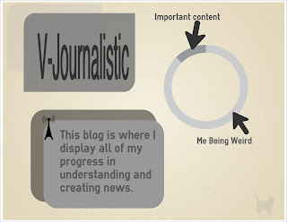
I made an infographic.

I made an infographic on easel.ly. Its about this blog; honestly, I don't think its that good but I think using this template was good practice. I tried to keep minimal colors and design because usually when infographics have too much going on it can go wrong very quickly. I don't think I can make a super fancy infographic at this time. I will be making a bunch more soon.

I didn't like the font choices for title. This really doesn't show any actual information but it just kind of described my blog.


Monday, March 18, 2013

Infographic of Infographics

I like this infographic because unlike the last one this one isn't trying to promote a business. I'm actually really surprised that health is the most popular topics because I haven't actually seen that many of them. This one also helps with the most popular features of an infographic.

Infographics about infographics

With the new making infofraphics thing I'm doing I thought it would be important to learn what an important infographics needs. The next few posts are going to be infographics about infographics.

Friday, March 15, 2013

Journalism Analysis + The future of my blog

So I have been debating making this post or not but I have decided to end my analysis because unlike the other things I have been doing it seems to much like a chore. I am going to be focusing more on the infographics and implementing infographics into my family history project which I will be starting in the next 2-3 weeks, or whenever I will see my family again.

Wednesday, March 13, 2013

Internet Addiction

Is internet addiction real?
This infographic is really applicable to me and a lot of the people in this class. The loafing happens a lot but I feel that a small addiction can help us a lot. We all spend a ton of time on the internet but how we use it is all different. The internet is a double edged sword and in this class I try my hardest (most of the time) to stay on track.

Monday, March 11, 2013

Journalism Infographic Competiton.

So I have signed up for a infographic competition for my school. It seems pretty cool; I will be given a set of data and some programs with which I have to create an infographic. It seems like a fun/hard task and I'm pretty excited to do this. Thats all I really know about it but If I learn more I will share it here.

Wednesday, March 6, 2013

History Of Prime Time Television: Infographic

So I'm pretty sure that you cant see all the details on this infographic but the first yellow line thing is the News  section. The amount of prometiome news shows grows greatly around the 1990's. The rest of the sections grew a bit as well. There is a slight decline towards today, this is most likely because of the internet but I dont think the amount of news programs will decline much more.

Monday, March 4, 2013

The Impact Of Twitter on Journalism

So I don't think this qualifies as an infographic. Honestly what visuals it does have are pretty annoying. Nevertheless this video holds a deep impact full meaning. Journalists cannot devalue the Internet, or more specifically, social media as a way to distribute news. Everyone can be a journalist everyone voice matters everyone has a story that can and should be shared.

Wealth Inequality in America: Video Infographic

Not only if this video incredibly visually pleasing it is also really interesting. It is videos like this that show how much we really don't know about whats going on in the country.