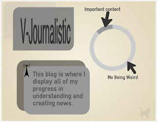
I made an infographic on easel.ly. Its about this blog; honestly, I don't think its that good but I think using this template was good practice. I tried to keep minimal colors and design because usually when infographics have too much going on it can go wrong very quickly. I don't think I can make a super fancy infographic at this time. I will be making a bunch more soon.
I didn't like the font choices for title. This really doesn't show any actual information but it just kind of described my blog.
Popular Posts
Blog Archive
-
▼
2013
(55)
-
▼
March
(12)
- Infographics
- Technology Free Day
- Family Project Infographic
- I made an infographic.
- Infographic of Infographics
- Infographics about infographics
- Journalism Analysis + The future of my blog
- Internet Addiction
- Journalism Infographic Competiton.
- History Of Prime Time Television: Infographic
- The Impact Of Twitter on Journalism
- Wealth Inequality in America: Video Infographic
-
▼
March
(12)
Labels
- Assesment Literacy (3)
- Blog (10)
- Book (9)
- Bye (1)
- Entertainment (4)
- Family Project (8)
- Field Research (4)
- Fundamentals Of Journalism (4)
- Group (10)
- If It Bleeds It Leads (4)
- Infographic (33)
- Internet (49)
- Interview (2)
- Journalism (7)
- Journalism Analysis Project (5)
- Journalists (12)
- Justice (1)
- Lifestyle (1)
- Love and Hate (5)
- Mission Statement (3)
- Money (2)
- New Project (2)
- Original Content (15)
- Outliers (2)
- PEW (4)
- Politics (3)
- Quotes and Pictures (7)
- Random (25)
- Review (19)
- RSA (1)
- Scholarship (2)
- Sports (2)
- Tech (21)
- Ted Talks (6)
- Television (9)
- Theme (2)
- University (6)
- USA (6)
- Video (14)
- World (6)
- Writing (9)
- Youtube (8)
My Favorite News Sources
Blog Archive
-
▼
2013
(55)
-
▼
March
(12)
- Infographics
- Technology Free Day
- Family Project Infographic
- I made an infographic.
- Infographic of Infographics
- Infographics about infographics
- Journalism Analysis + The future of my blog
- Internet Addiction
- Journalism Infographic Competiton.
- History Of Prime Time Television: Infographic
- The Impact Of Twitter on Journalism
- Wealth Inequality in America: Video Infographic
-
▼
March
(12)


0 comments:
Post a Comment